Let’s start with a story...
During college, I often see international classmates struggle with renting in NYC due to inexperience.
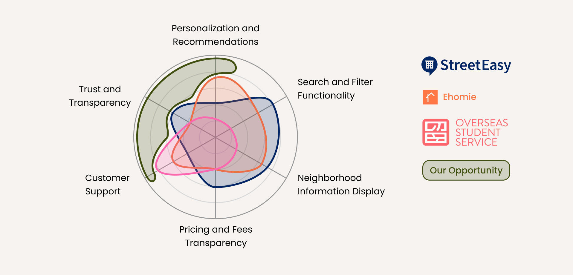
Research: About International Students

Understand the users
I proceeded by conducting a screener survey among potential users, consisting of ten simple questions with 40 participants. This questionnaire provided valuable quantitative data.

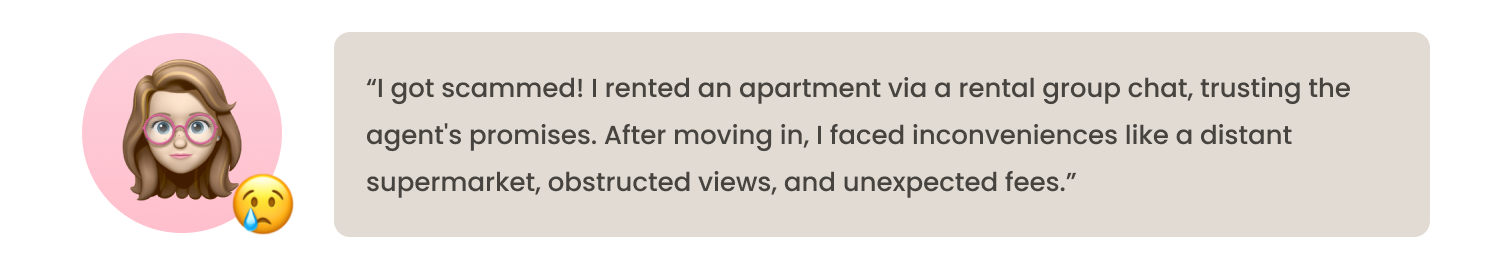
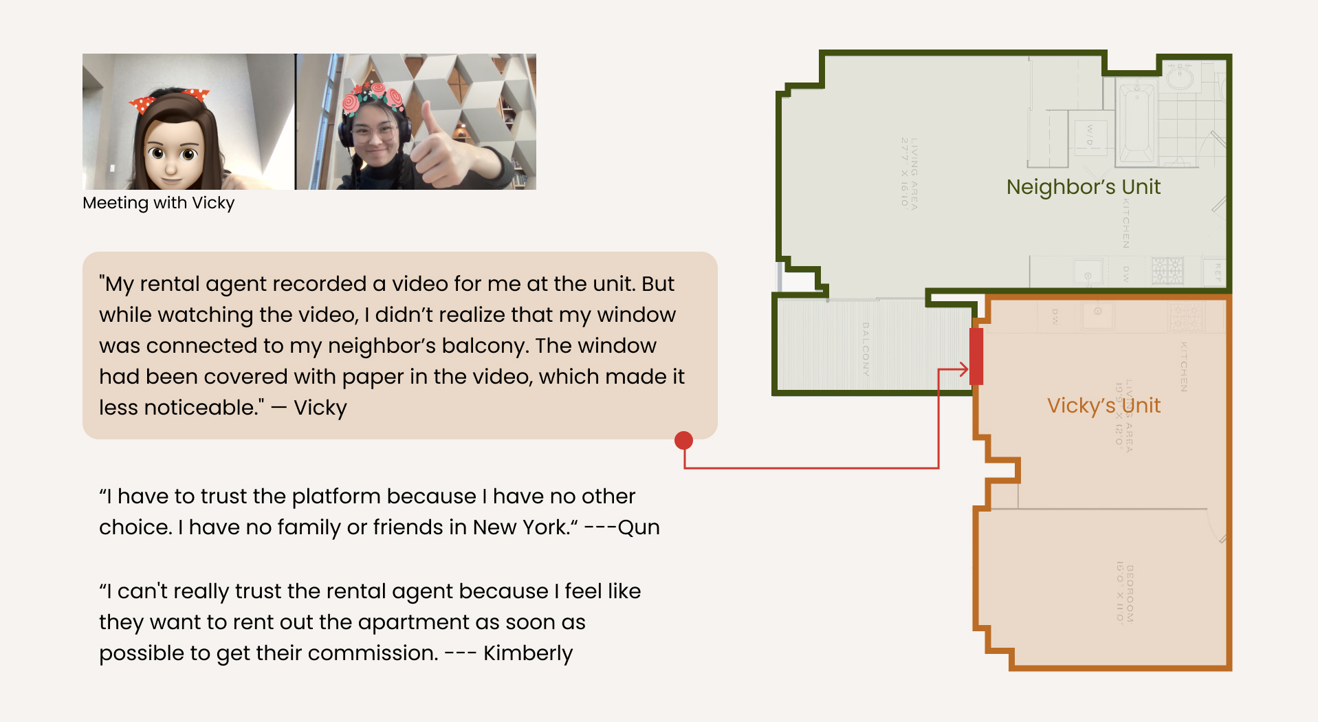
Then, I conducted interviews with three survey participants to gather firsthand insights into their rental experiences. Below are some quotes about how much they trust the rental platform / agents.
Conducting interviews provided me an opportunity to delve deeper, acquire qualitative data, and attain a more comprehensive understanding of user attitudes and experiences.
Collect & Observe
Making an affinity map helps me to categorize the commonalities and variations in participants' responses.
I discovered that my interviewees faced challenges in establishing trust with rental agents due to limited options and insufficient information from existing resources. When inquiring about their actual check-in experiences, each interviewee expressed discrepancies between their real experiences and the descriptions provided by agents regarding the rooms and communities. They believed that some agents deliberately omitted shortcomings and issues with certain properties to expedite the contract process.
Who am I designing for?
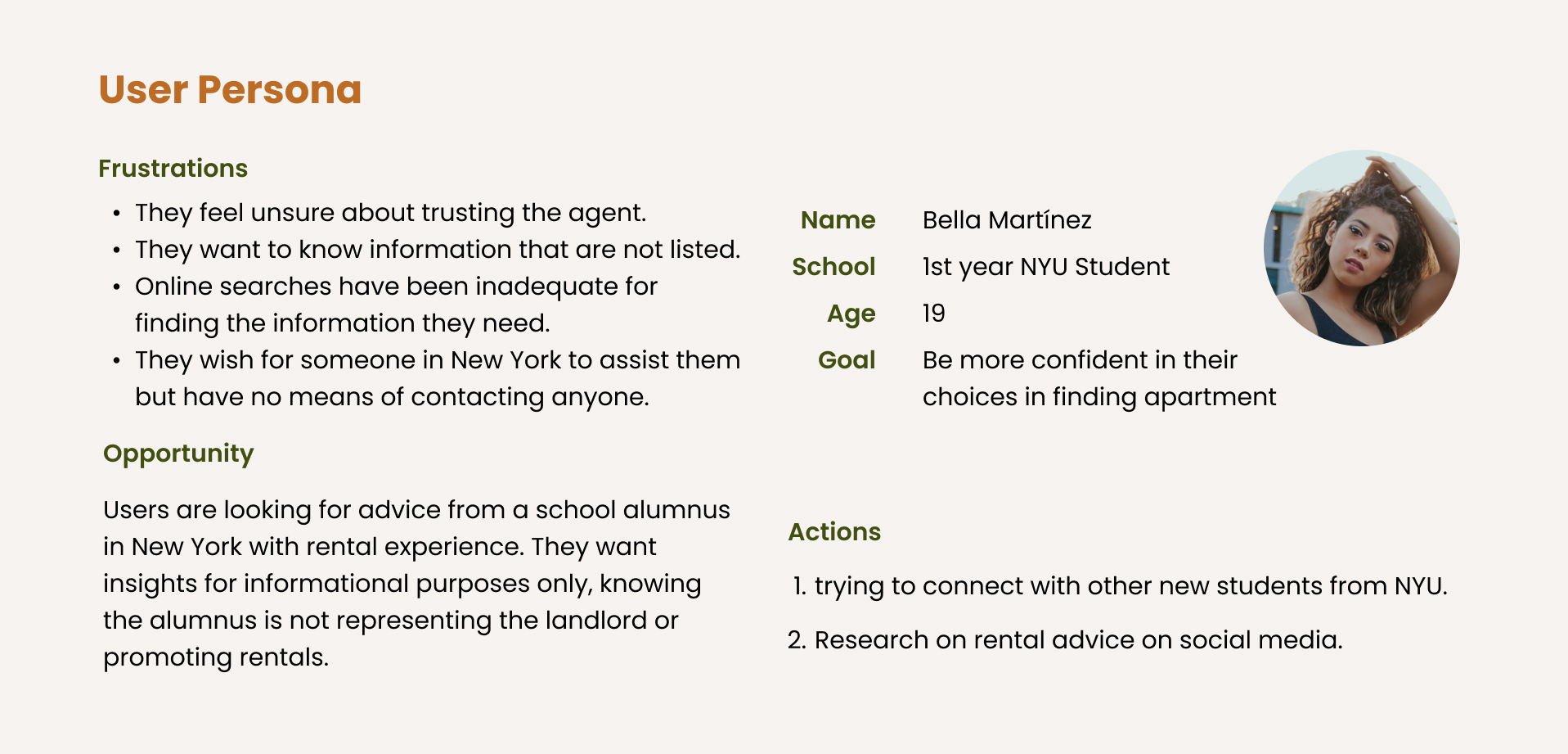
I made these Personas to help me focus on the users’ needs for this specific target user group throughout the design process.
Ideation
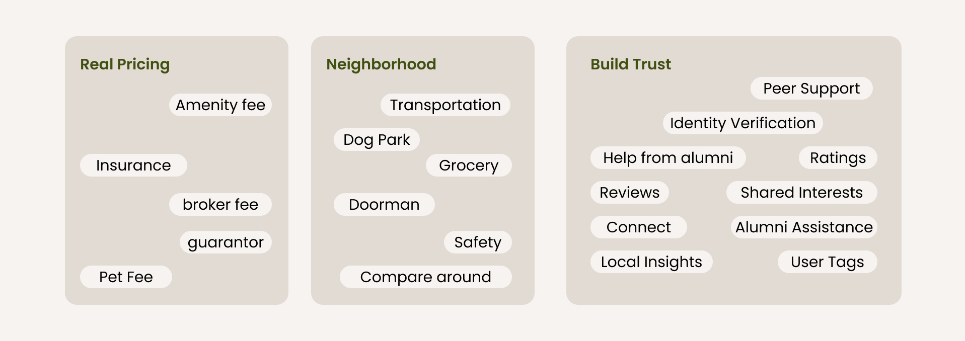
After finding the pain points, I started to Identify Opportunities by writing the How Might We questions to help me keep the focus on the needs and experiences of users throughout the whole design process.
“How might we enable users to acquire reliable insights about neighborhoods or buildings from trusted sources, enhancing their confidence in selecting an apartment?”
User Story Map / Wireframe
Based on the "How Might We" questions, I've developed a user story map to organize and prioritize features for our Minimum Viable Product (MVP).

Usability Testing
Feedback time! Here's where the real fun kicks in: I get to run two rounds of usability testing with 3 adventurous participants each!

Note: Click here to see the full test script.
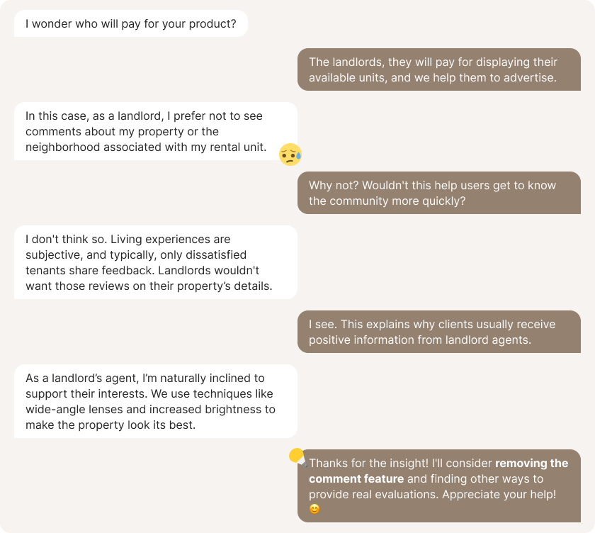
Regarding the comment section on the unit detail page, I had a discussion with Seth, a NYC rental agent.
Usability testing allows me to measure whether users can comfortably and efficiently achieve their goals while providing valuable feedback on my design. This process helps identify areas for improvement and enhances the overall user experience. Below are some insight I collected.
- Reduce scrolling
- Remove comment space of the neighborhood
- Decrease the amount of text to read, use more icons
- Find another solution for users to find help in asking for advice
- Allow users to forward a unit to start conversation
Rental Mentor Solution
During the interviews, I asked participants if they would be open to offering advice to future international students renting in New York. Surprisingly, all interviewees eagerly shared valuable insights from their own experiences. A common theme was the importance of seeking guidance from those with prior rental experience in New York or classmates from the same school. Below is the revised user experience, based on the usability test.
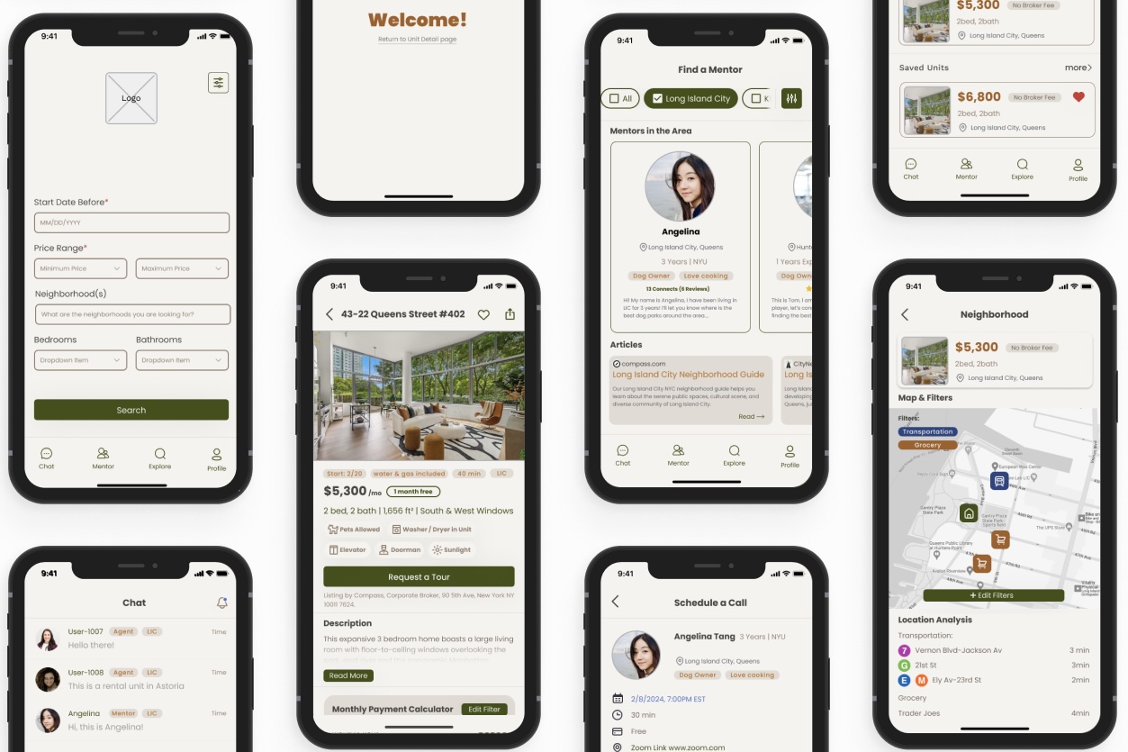
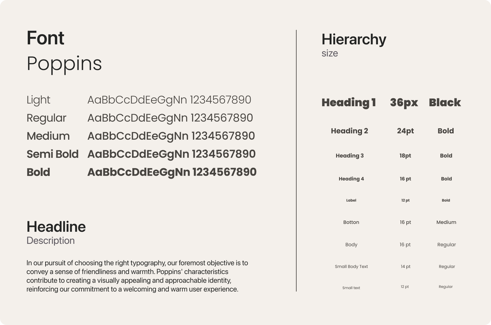
Style Guide & Hi-fi Design
To better maintain consistency, I have created a set of design style guides including system color, typeface, text hierarchy, buttons, and icons. Consistent design helps users navigate the interface more easily and builds trust in the product.
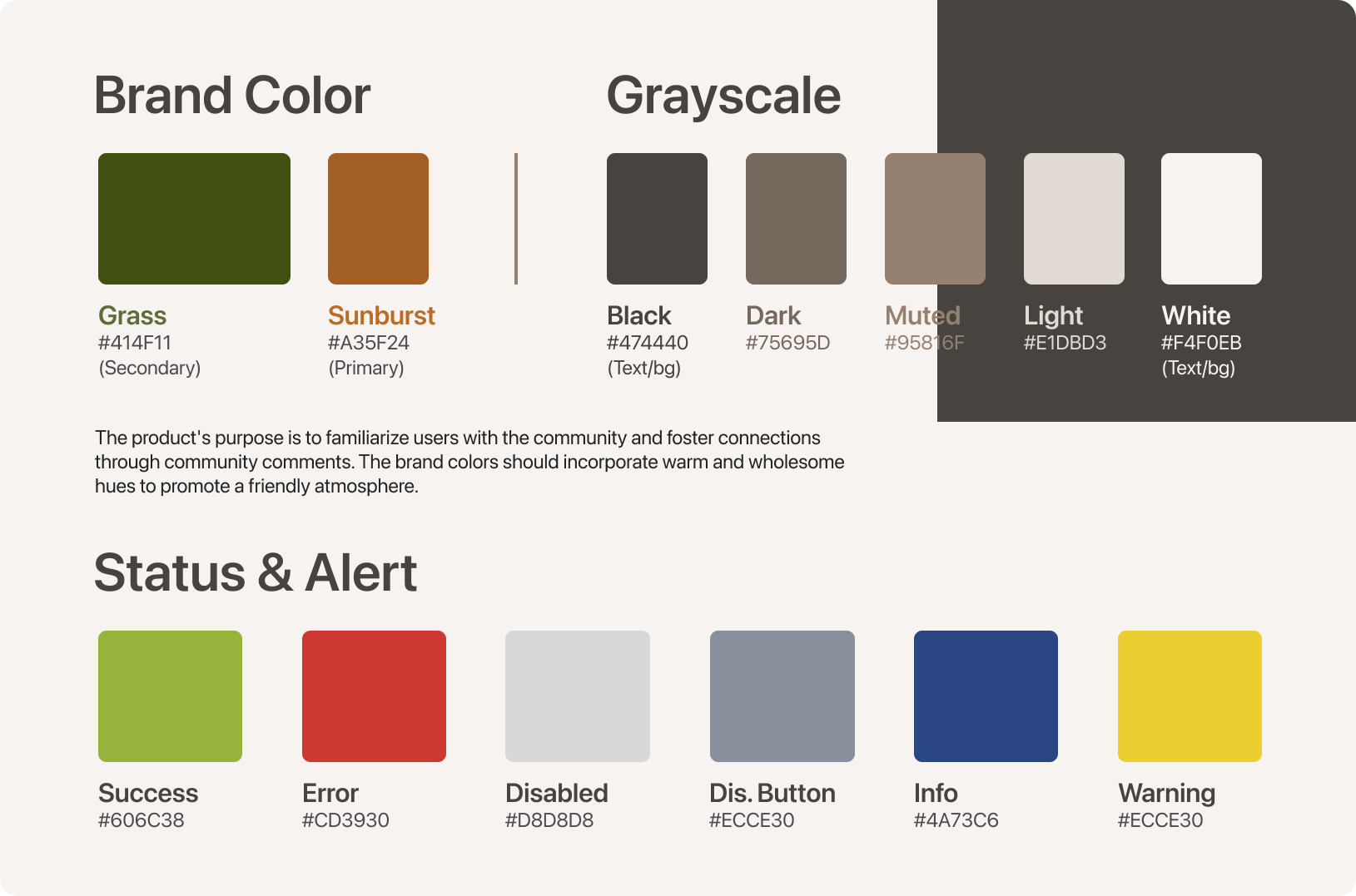
I chose a warm color scheme to deliver a warm and friendly atmosphere to the user when they first enter the app. Then, I selected Poppin, the perfect typeface for the app UI. Poppin ensures clean and inviting designs that resonate with users. Its rounded corners and balanced proportions maintain readability across screens.
Prototype: Search
Prototype: Login
Note: Click here to play with the Prototype.