
“The text description of the art pieces is too overwhelmed to read”
Welcome to the Gallery Pal UX design sprint!
Gallery Pal is the design sprint project I’ve chosen to conduct this 1 week design sprint. The project addresses the common issue faced by visitors who find traditional methods of accessing information about artwork overwhelming or unengaging.
Over the course of five intense days, I dive deep into understanding the pain points of gallery visitors and crafting innovative solutions to elevate their experience.
Understand the User
The problem is twofold: visitors want to delve deeper into the context of art pieces during their visit but are deterred by lengthy descriptions.
Interviews with visitors revealed key insights, such as the preference for expert insights without the need for group tours, the desire for information about the artist and their techniques, and the importance of storytelling in enhancing the art-viewing experience.
“When searching for some information about the art, they usually find long articles that are super overwhelming.” (John)
“Feel like missing out on the full experience by not knowing background information and contact.” (Anna)
“I would like to know more about the process of making and the technique the artist used.” (Dana)
Insights from experienced guides, like Lena Carroll - an experienced tour guide at the Museum of Natural History in New York , emphasized the significance of creating a narrative around the artwork to engage visitors effectively.
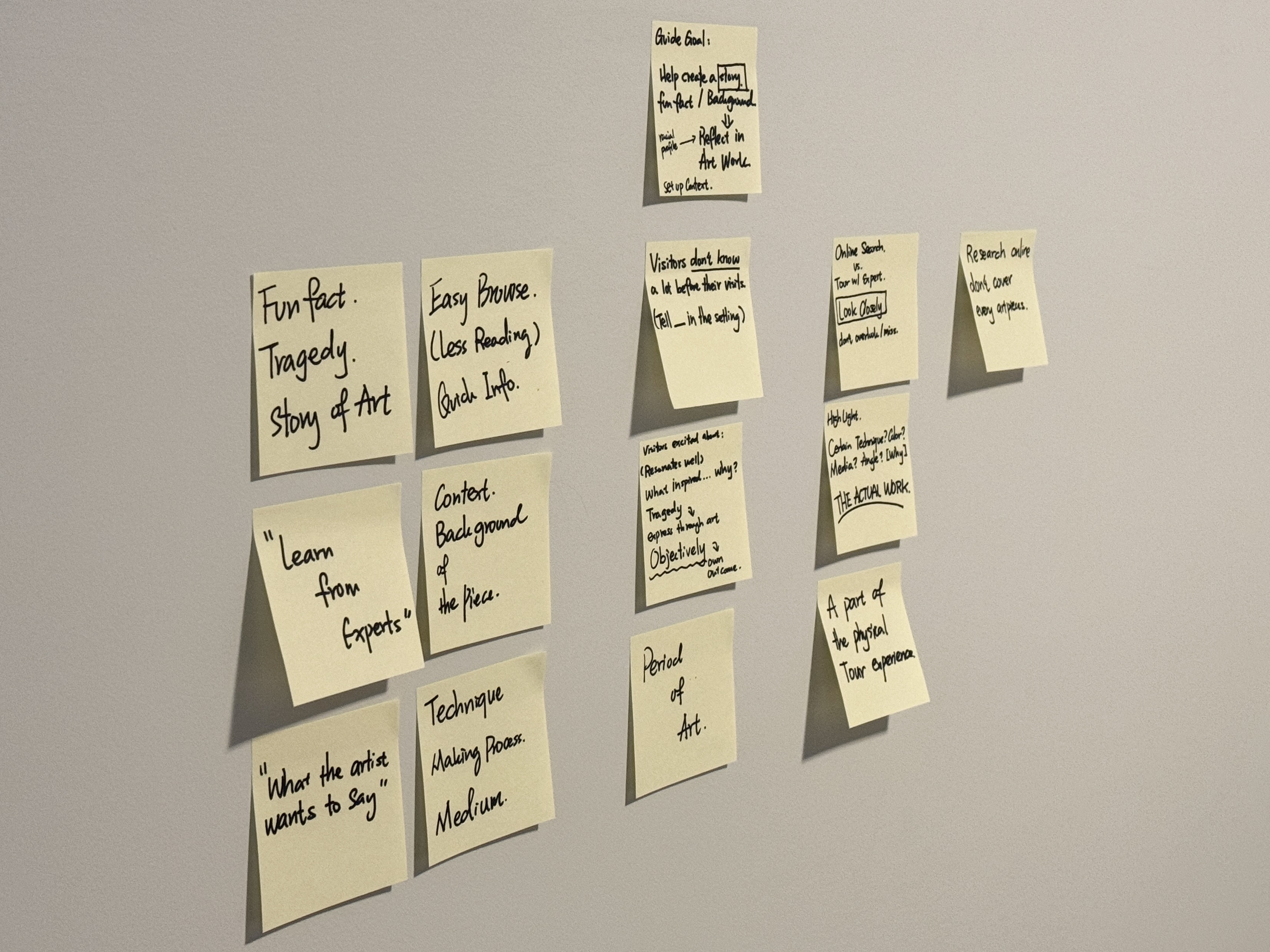
- The goal of a museum tour is to help the audience to create a story in their mind.
- People are more interested in knowing some fun fact, tragedy the artist or the art experienced, and they want to hear stories.
- How do these fun facts or tragedy reflect in the art piece? How did the artist explain through the art?
- A benefit of a museum tour is to allow the audiences to see the artwork in person, and the museum setting helps me to explain the context.
How Might We...?
The HMW question formulated based on these insights is: How might we provide visitors with quick and engaging information about artwork during their visit to ensure they make the most out of their experience?
Now, the Sprint Starts
Day 1: Mapping and Flow
The First day of the sprint focused on mapping out the visitor journey and identifying key touchpoints where the app could enhance the experience.
During interviews with three museum visitors to understand their experiences, key steps emerged, including researching ongoing exhibitions, purchasing tickets, physically attending the museum, navigating to the desired exhibition, exploring artworks, learning about the exhibition, and visiting the museum shop.
Below is a user flow depicting the audience's journey through the gallery visit, integrating these proposed features seamlessly.

To enhance the in-person experience and make art context more accessible, I proposed incorporating features such as scanning artworks for more information and utilizing augmented reality to provide insight into the subject matter. The concept involves highlighting fun facts by circling elements on virtual screens, allowing users to quickly grasp the context of the artwork visually.
Day 2: Lighting Demos
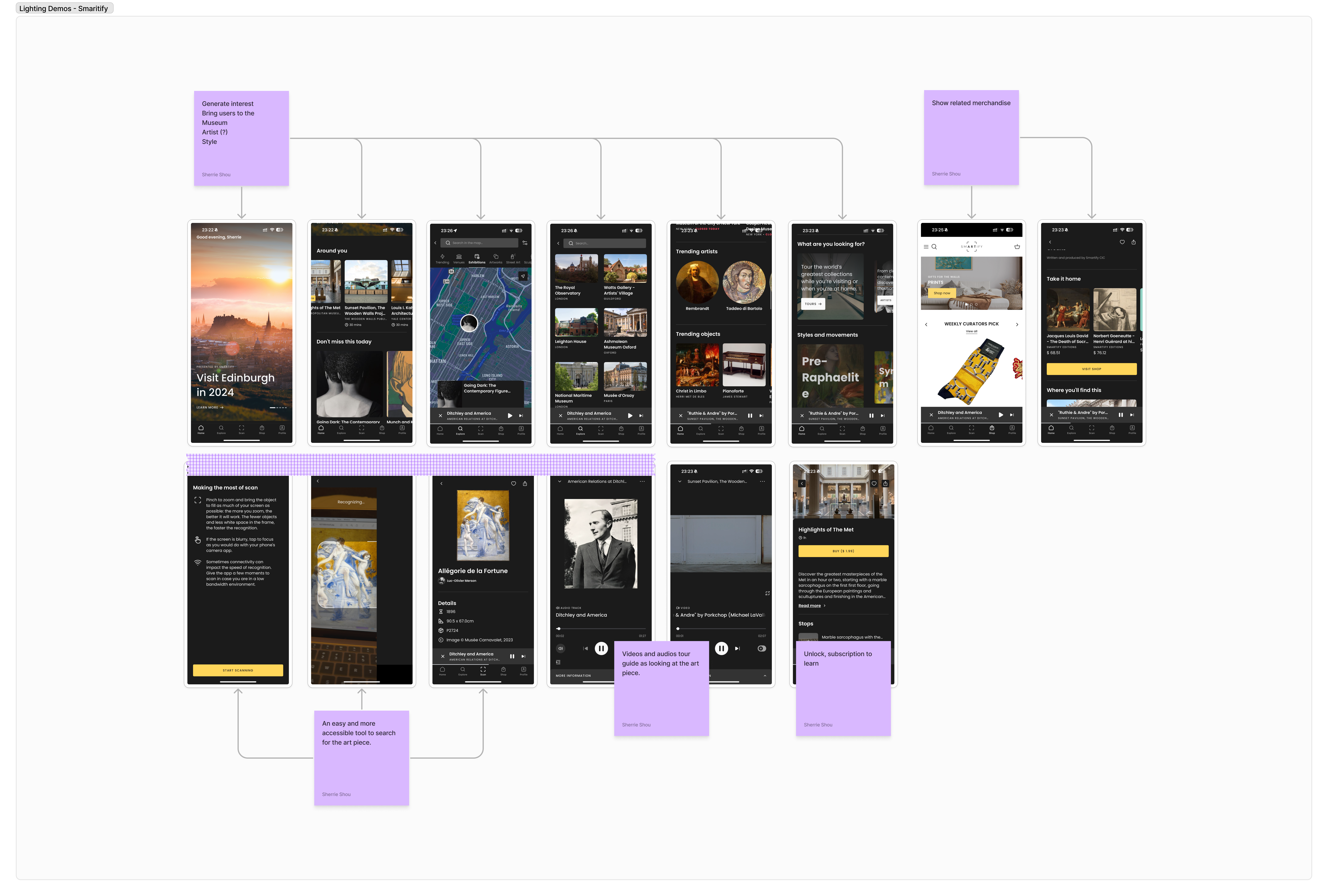
During Day 2, I conducted research on existing museum tour apps to gain insights into their features and limitations. While exploring apps like Daily Art, Google Art & Culture, Smaritify, and Connects, I observed distinct patterns.
Daily Art and Google Art & Culture primarily prioritize digital experiences over supporting in-person museum visits.
Moreover, searching for specific artworks on Daily Art and Google Art & Culture can be challenging, requiring users to input the name of the artist or artwork. In contrast, Smaritify and Connects offer a more user-friendly approach to searching by allowing users to scan images or QR codes to find art pieces.
Additionally, all these apps aim to spark user interest by providing daily content updates.
Furthermore, they typically present introductory information often in paragraph format and audio guide.


Day 3: Sketches
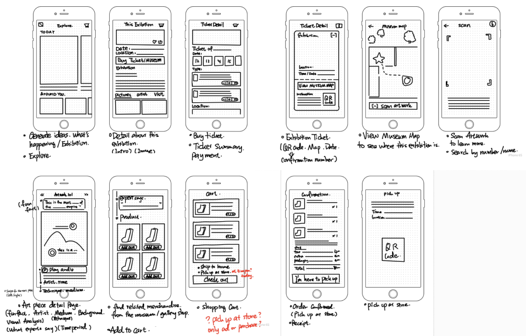
Sketching out crucial screens of the app, particularly the artwork description page, focused on minimizing text and incorporating audio features for information delivery. Considerations for one-handed usage and ergonomic reach were integrated to ensure usability in different scenarios.
Day 4: Prototype
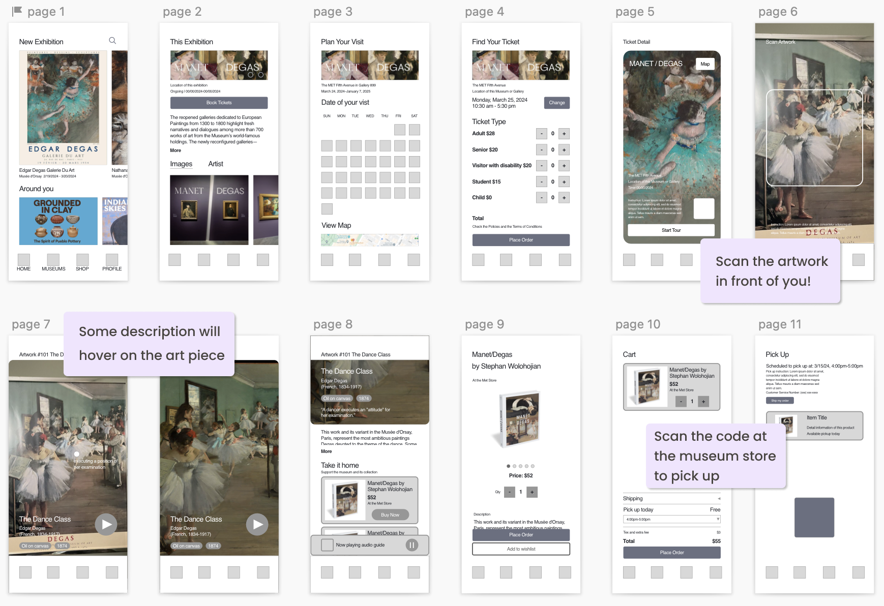
A low-fidelity prototype was designed using Sketch, laying the groundwork for the app's functionality and wireframe. This stage focused on translating ideas into tangible interactions for testing and refinement.
Day 5: Testing:
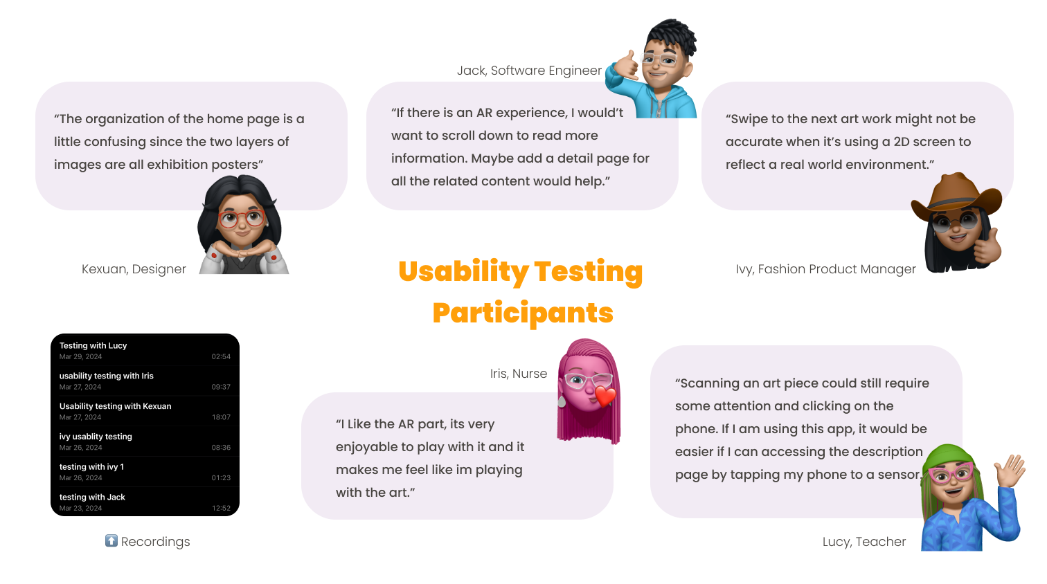
Usability testing with five participants, all experienced provided valuable feedback on the app's usability and features. Insights gathered included positive reactions to the AR experience, dissatisfaction with the swiping feature, and preferences for detailed information accessible via the detail page.
Future Iterations:
Based on the test results, future iterations will focus on refining the organization of the home page, addressing usability concerns regarding navigation, and enhancing the detail page to provide comprehensive information about each artwork. Additionally, incorporating user feedback will be integral to ensuring Gallery Pal meets the needs and expectations of its target audience effectively.
By detailing each phase of the design sprint, along with the insights gained and decisions made, your case study effectively demonstrates your process and problem-solving skills in UX design.
⬅️ Let’s collaborate - Email me or meet me on LinkedIn!